
Meredithnorvell.com is a page-turner
Designed and built with interactive book elements that steal the show

Meredithnorvell.com is for publishers and social media followers to visit and browse. In our first session, we pulled together what the client already had: her logo, color scheme, professional headshots, and a Pinterest board of inspiration for her upcoming book. We also walked through websites that stood out to her and unpacked what she liked about them.
Video of meredithnorvell.com
Towards the end of the meeting, I pulled up elements that caught my eye for this website, ones I had already compiled into a style guide ahead of time. My style guide is usually a Google Slides deck, with a slide for each component that separates a professionally designed website from the others—custom menu, loader, banner, font mix, color palette, scroll features, and subtle animations. Ultimately, we picked the best headshot for the homepage, of her reading on the couch that was horizontal, and both loved the idea of using the book loader animation.
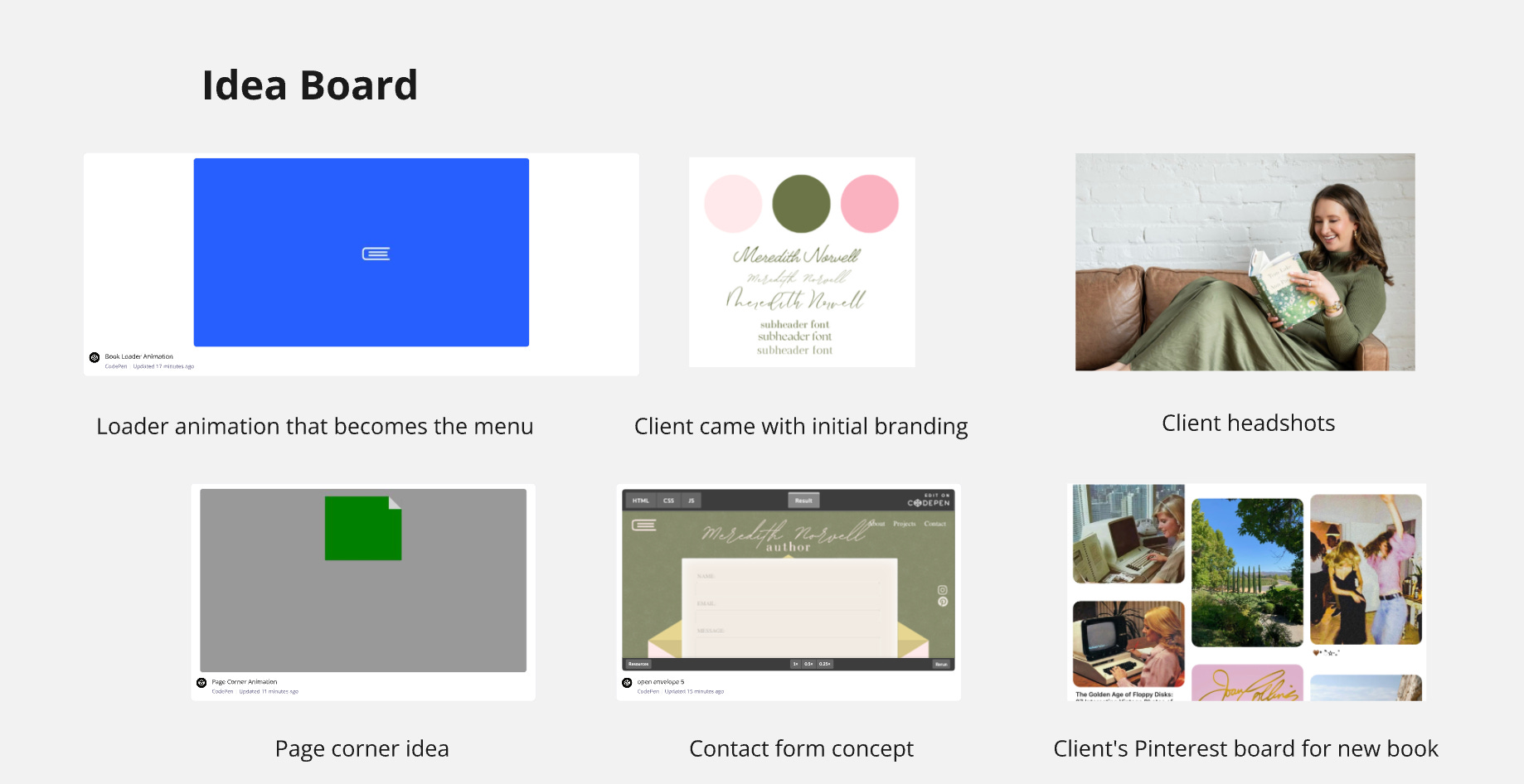
Post-meeting, while messing around with the book animation, I noticed it sort of looked like a menu and thought it would be cool if it was one. So I got to work, reversing the way the animation opened and closed, reducing the number of pages, making it open and close only once, and moving it to the top left corner of the screen once it opened and closed in the center. Early on, I realized I had to consider browser compatibility because the pages were flipping upside down on Safari. Since Safari struggles with rotateZ(180deg), I adjusted it to 179 degrees, and that did the trick. Once the closed book transitioned to the upper left corner, I set its display to none so that book2 could take its place. That way, when you clicked on book2, it would open a sliding menu. I also had to convert the code to simple HTML, CSS, and JS in case we were to inject it into a website builder like Wix. Due to time constraints, I passed the baton of book2’s sliding menu to the global team I’ve assembled. The header looked a little left-heavy with the book, especially on mobile, so I decided to add a custom-designed page ear on the right corner that served as a button when clicked, leading to the client's upcoming book.
With those two elements inserted, I also noticed the hero text looked a little bland and decided to add a drop cap, making the first letter big, similar to the first chapter of a book. Meredith loves flowers, and I was inspired by the Veronica Beard website to add animated flowers to the footer of the website, with a wavy page section separator to the footer that flowed with the headshot we selected. With these elements in place and after refining the screen breakpoints for optimal display across all screen sizes and browsers, the homepage took shape. In parallel, I was busy designing the other pages.
While considering the design for the page of Meredith’s book, I thought about the book itself. Set in the ’80s, centered around one of the few women in tech at the time. Found a font pairing, Red Hat Mono and Manrope, that look great together and work with the feminine tech-forward feel of the book. For the visual on the about page, while looking at her Pinterest board for her book, I thought why not into Pinterest but with two columns and a scrollable layout. For the mobile view, I made it horizontal. Later used that content for a promo post about her upcoming book, Bright Silicon Stars.
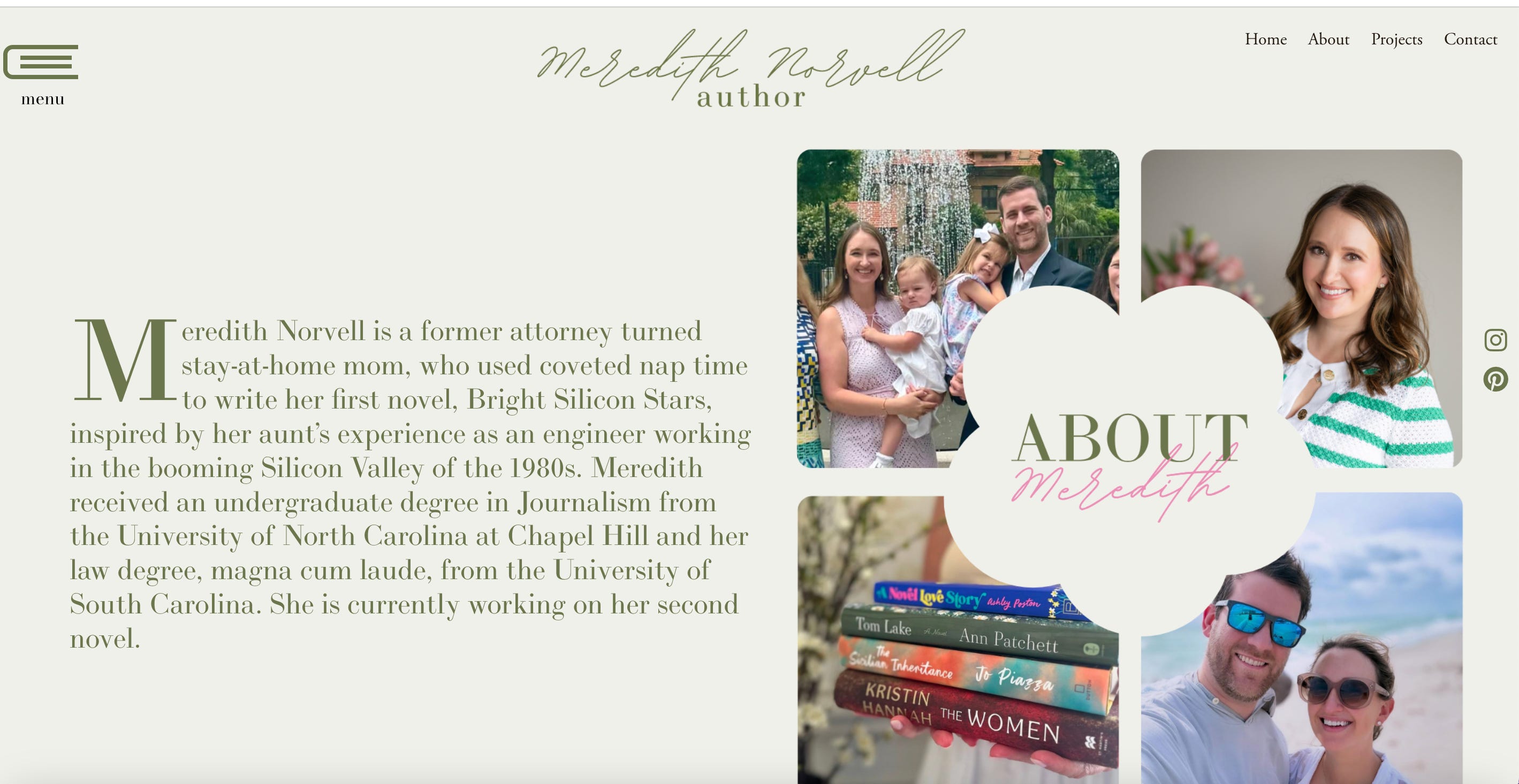
For the about page, I kept it simple. I didn’t want to use the same concept as the Bright Silicon Stars book page to display photos, so I found a 2x2 gallery on Canva and put a flower in the middle, and exported it as an svg.
Same with the contact form. Though, I really wanted to make it more fun by adding an interactive envelope, which I started here. Due to time constraints, I just made the contact page different colors and simple yet elegant. Thrilled with how this website turned out. Visit meredithnorvell.com to view it live.